Canvas Elements Guide
Everything you can create and interact with on the Kolab canvas. This guide covers standard elements (sticky notes, text, shapes, images, and embeds) plus facilitator-added media.
Having issues? Run System Check to verify your setup.
Element Types Overview
| Element | Icon | Best For |
|---|---|---|
| Sticky Note | 📝 | Ideas, feedback, brainstorming |
| Text | T | Labels, headings, longer text |
| Rectangle | ▢ | Zones, frames, highlighting |
| Circle | ○ | Diagrams, emphasis, labels |
| Image | 🖼️ | Photos, diagrams, screenshots |
| iFrame/Embed | 🔗 | Web content and playable embeds |
| Animated Media | 🎞️ | Ambient GIF/WebM/MP4 loops |
| Ambient Sound | 🔊 | Background audio on the canvas |
| Screen Share | 🖥️ | Live screen sharing (Interactive mode only) |
| Card Deck | 🃏 | Interactive cards for activities |
Note: Screen sharing, card decks, sticky banks, and ambient media are typically created by facilitators.
Sticky Notes
What They're For
Sticky notes are the workhorse of collaboration:
- Quick ideas and thoughts
- Brainstorming contributions
- Feedback and comments
- Voting items
- Moveable content
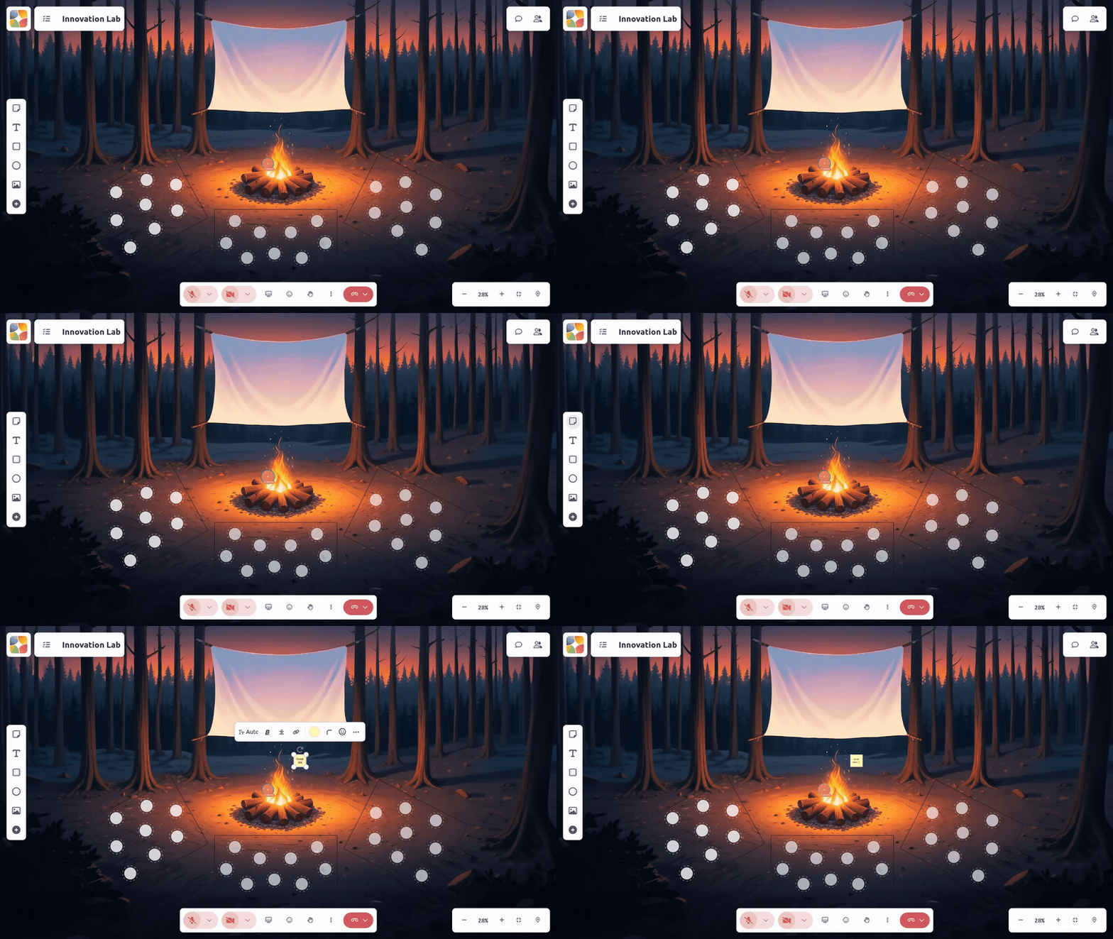
Creating a Sticky Note
- Click the Sticky Note icon in the toolbar
- Click on the canvas where you want to place it
- Start typing your text
- Click outside to finish
Editing Sticky Notes
- Click to select
- Double-click to edit text
- Click outside to finish editing
- Text auto-saves as you type
Sticky Note Colors
Change the color:
- Select the sticky note
- Click the Color menu
- Choose your color
Pro tip: Use colors to categorize—green for ideas, yellow for questions, pink for concerns.
Default Shape (Facilitators)
Facilitators can set which shape new stickies use on a board. Click the small caret on the sticky note toolbar button and choose Square or the wider Rectangle.
This only changes stickies created from then on—existing ones keep their shape. It's set per board, so different boards in the same space can each have their own default.
Moving and Resizing
- Drag to move
- Drag corners to resize
- Drag edges to stretch
Auto-grow: As you type, a sticky first shrinks its text slightly to keep everything fitting. If it still doesn't fit, the sticky itself grows a bit—keeping its shape—rather than clipping your text, and the text size settles back to something readable. Once you resize a sticky yourself, auto-grow stops for that note.
Text Elements
What They're For
Text elements are for:
- Section labels and headers
- Longer explanations
- Instructions on canvas
- Persistent reference text
Creating Text
- Click the Text icon (T) in the toolbar
- Click on canvas
- Start typing
- Click outside to finish
Text Formatting
Select text to access formatting:
- Bold (Ctrl/Cmd + B)
- Italic (Ctrl/Cmd + I)
- Font size
- Text color
- Alignment (left, center, right)
- Vertical alignment (top, middle, bottom)
Text vs. Sticky Note
| Feature | Sticky Note | Text |
|---|---|---|
| Background | Colored | Transparent |
| Best for | Ideas, moveable items | Labels, headings |
| Visual weight | Prominent | Subtle |
Shapes: Rectangle
What They're For
Rectangles help organize:
- Creating zones/areas
- Framing content
- Background for sections
- Highlighting regions
Creating a Rectangle
- Click the Rectangle icon in the toolbar
- Click and drag on canvas
- Release to complete
Styling Shapes
Select a shape to open its toolbar. Shapes (rectangles and circles) have rich styling controls:
| Control | What it does |
|---|---|
| Fill | A solid color or a gradient for the background |
| Border style | Solid, Dashed, or Dotted |
| Border width | How thick the outline is |
| Border color | The outline color (or no border) |
| Border opacity | How transparent the outline is |
| Rounded corners | Soften the corners (rectangles, sticky notes, and text—not circles) |
Tip: Want a clean container with no outline? Set the border to No border and give it a light fill.
Shapes with Text
Add text to rectangles:
- Select the rectangle
- Double-click to add text
- Text appears centered
Shapes: Circle
What They're For
Circles (ellipses) work for:
- Diagrams and flowcharts
- Emphasis and callouts
- Visual variety
- Avatars and icons
Creating a Circle
- Click the Circle icon in the toolbar
- Click and drag on canvas
- Release to complete
Tip: Hold Shift while dragging for perfect circle.
Circle with Text
Like rectangles, circles can contain text:
- Select the circle
- Double-click
- Add your text
Images
What They're For
Images bring visual content:
- Diagrams and charts
- Photos and screenshots
- Reference materials
- Visual instructions
Adding Images
Method 1: Upload
- Click Image in toolbar
- Select file from your device
- Image appears on canvas
Method 2: Drag and Drop
- Drag one or more image files from your computer (SVGs work too)
- Drop onto canvas
- Each image uploads and appears—drop several at once and they cascade slightly so they don't land in an exact stack
Method 3: Paste
- Copy an image (from web or app)
- Click on canvas
- Paste (Ctrl/Cmd + V)
Image Sizing
- Drag corners to resize (maintains aspect ratio)
- Drag edges to stretch (changes aspect ratio)
- Double-click to reset to original size
Supported Formats
- PNG, JPG, JPEG, GIF
- SVG
- WebP
iFrame/Embeds
What They're For
Embeds bring external content to canvas:
- YouTube videos
- Google Slides
- Miro boards
- Figma designs
- Any embeddable web content
Adding Embeds
- Copy an embeddable URL from the source service
- Open Tools & Media menu
- Select Embed or iFrame
- Paste the URL
- Click Add
Interacting with Embeds
Depending on the source:
- YouTube - Play/pause video
- Google Docs - May be viewable or editable
- Miro - View or edit (requires login)
Embed Aspect Ratio
Adjust how the embed displays:
- Select the embed
- Find aspect ratio control
- Choose appropriate ratio (16:9, 4:3, etc.)
Importing from Miro & Mural
Already have work started in Miro or Mural? Bring it into Kolab as real, editable elements instead of retyping everything.
- In Miro or Mural, select the items you want and copy them.
- Click your Kolab board, then paste with Ctrl + V (or Cmd + V on Mac).
Important: It has to be the keyboard shortcut—pasting from a right-click menu won't trigger the conversion.
Kolab converts what it can into native, editable elements:
| From Miro/Mural | Becomes in Kolab |
|---|---|
| Sticky notes, shapes, text | Sticky notes, shapes, and text elements |
| Miro frames | Outlined frame containers |
| Mural clusters/areas | Titled frames |
The relative layout of what you copied is preserved when it lands on your board.
A few element types can't convert yet—images, connectors/arrows, and freehand drawings. Kolab skips these and shows a quick heads-up telling you how many items couldn't come across.
Not the same as an embed: Pasting creates real, editable Kolab elements, once. If you want a live, interactive view of an actual Miro board instead, use an embed—that stays connected to the source and updates in real time.
Ambient Media (Facilitator-Added)
Some spaces include facilitator-added environmental elements:
- Ambient Animation - GIF, WebM, or MP4 loops on the canvas
- Ambient Sound - Background audio sources on the canvas
- Sticky Banks - Pre-generated stacks or grids of blank stickies
These are most common in Interactive sessions and may be locked by facilitators.
Common Element Actions
Selecting Elements
- Single click - Select one element
- Shift + click - Add to selection
- Ctrl/Cmd + click - Toggle items in selection
- Shift or Ctrl (Control on Mac) + drag - Draw a selection box around multiple elements
- Alt (Option on Mac) + click - Cycle through overlapping elements one at a time
For the full rundown—including adding to a stacked selection—see selection tricks on the canvas basics page.
Moving Elements
- Drag - Move freely
- Arrow keys - Nudge in small increments
- Shift + Arrow - Nudge in larger increments
Copying and Pasting
- Ctrl/Cmd + C - Copy selected
- Ctrl/Cmd + V - Paste
- Ctrl/Cmd + D - Duplicate in place
Deleting Elements
- Delete or Backspace - Delete selected
- Right-click → Delete
Element Menu
Click an element to see its menu bar:
- Color picker
- Formatting options
- Lock/unlock
- Delete
- More options (...)
Element Layering
Z-Index (Front/Back)
Elements stack in layers:
- Newer elements appear on top
- Can reorder via right-click menu
Bring to Front / Send to Back
- Right-click the element
- Choose Bring to Front or Send to Back
- Or use keyboard shortcuts if available
Element Reactions
Adding Reactions
Some spaces allow emoji reactions on elements:
- Hover over an element
- Click the reaction icon (😀)
- Choose your emoji
- Reaction appears on element
Viewing Reactions
- Reaction badge shows on element
- Hover to see who reacted
- Click to add your own
Locking Elements
Why Lock?
Prevent accidental edits to:
- Template content
- Instructions
- Important frameworks
- Background elements
How to Lock
- Select the element
- Find Lock in element menu (🔒)
- Element is now locked
Locked Element Behavior
- Can't be moved, edited, or deleted
- Can be unlocked by the person who locked it
- Facilitators may unlock any element
Tips for Effective Canvas Use
Organize with Color
Use consistent color coding:
- One color per category
- One color per team
- One color per priority level
Use Alignment
- Align elements in rows/columns
- Use grid snap if available
- Consistent spacing looks professional
Don't Overcrowd
- Leave whitespace
- Group related items
- Create distinct zones
Layer Strategically
- Shapes as backgrounds
- Sticky notes on top
- Text for labels
Related Guides
- Using the Canvas - Navigation and basics
- Keyboard Shortcuts - Quick actions
- Presence & Cursors - Collaboration awareness
- System Check - Verify your setup